


React Native Study03_Navigation
# React Native Navigation ### Contents 1. Getting started 2. Hello Reac...
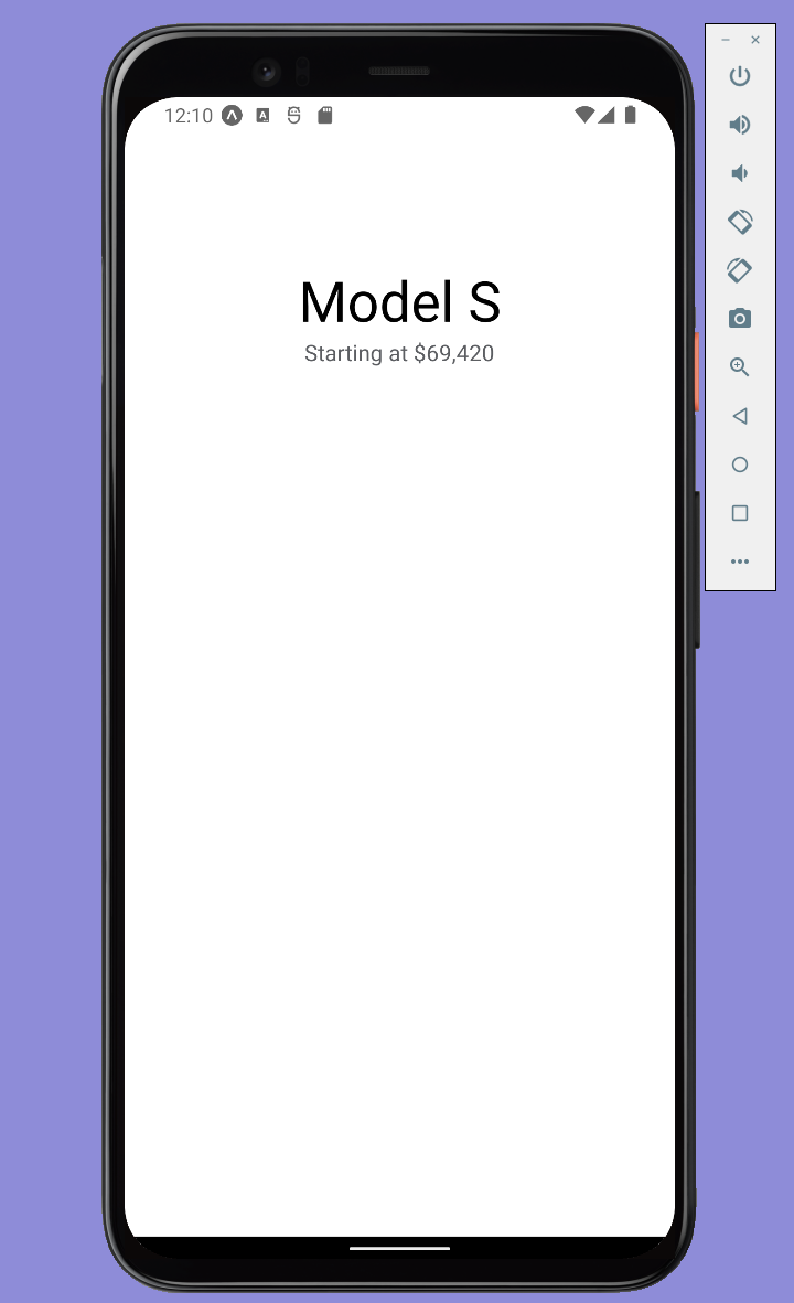
import { StatusBar } from 'expo-status-bar';
import { StyleSheet, Text, View } from 'react-native';
export default function App() {
return (
<View style={styles.container}>
<View style={styles.carContainer}>
<View style={styles.titles}>
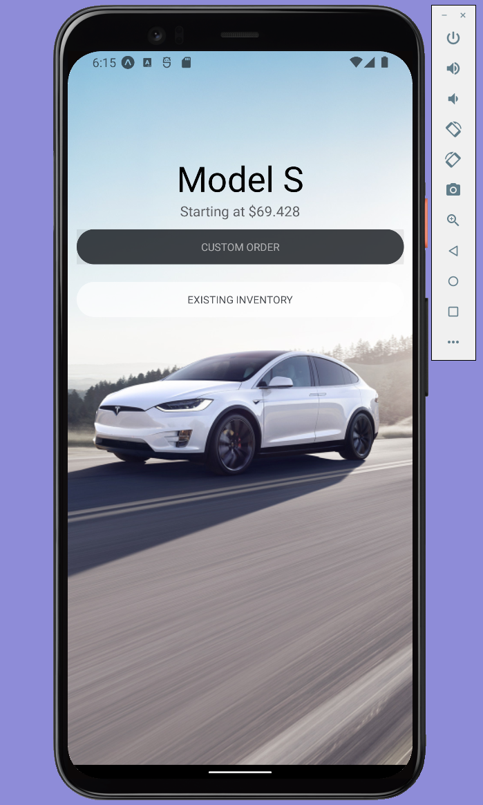
<Text style={styles.title}>Model S</Text>
<Text style={styles.subtitle}>Starting at $69,420</Text>
</View>
{/*<View></View> = Component를 Group으로 관리*/}
{/*style={styles.__} = 스타일 지정(스타일은 하단에서 설정))*/}
</View>
<StatusBar style="auto" />
</View>
);
}
const styles = StyleSheet.create({
container: {
flex: 1,
backgroundColor: '#fff',
alignItems: 'center',
justifyContent: 'center',
},
carContainer:{
width:'100%',
height:'100%',
},
titles:{
marginTop:'30%',
width:'100%',
alignItems:'center'
},
title:{
fontSize:40,
fontWeight:'500',
},
subtitle:{
fontSize:16,
color:'#5c5e62'
},
});
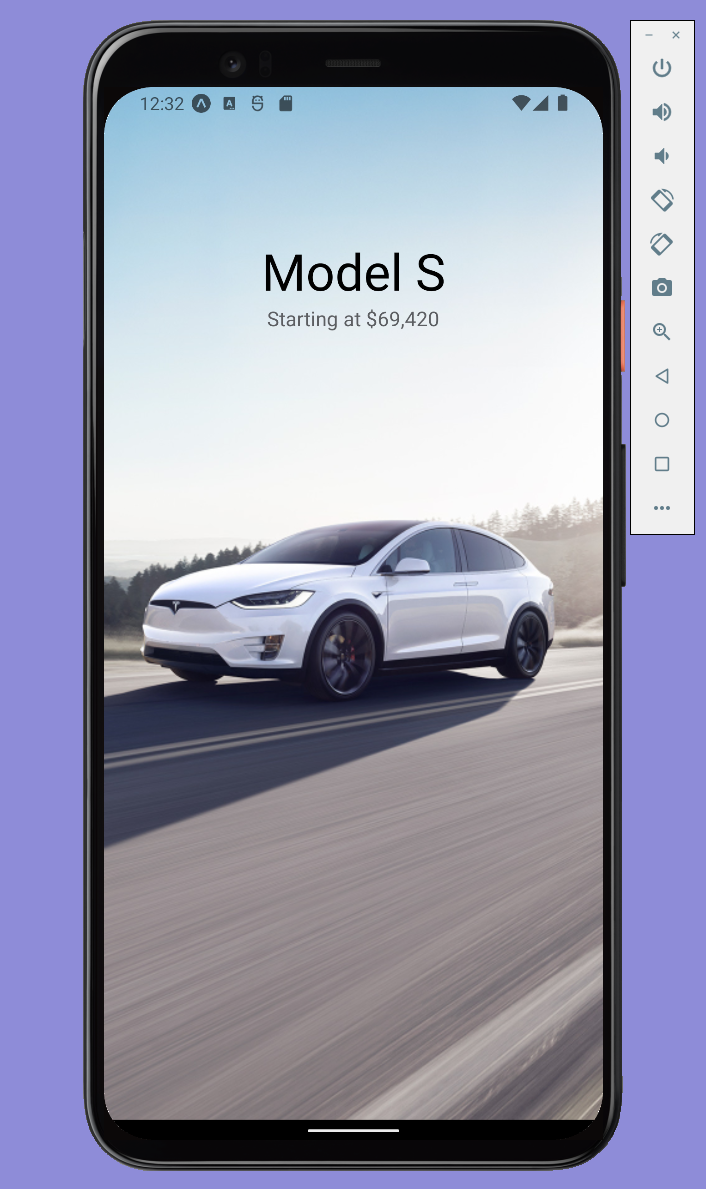
import { StatusBar } from 'expo-status-bar';
import { StyleSheet, Text, View } from 'react-native';

export default function App() {
  return (
    <View style={styles.container}>

      <View style={styles.carContainer}>
        <ImageBackground
          source={require('../assets/images/ModelX.jpeg')}
          style={styles.image}
        />

        <View style={styles.titles}>
          <Text style={styles.title}>Model S</Text>
          <Text style={styles.subtitle}>Starting at $69.428</Text>
        </View>
      </View>

      <StatusBar style="auto" />
    </View>
  );
}

const styles = StyleSheet.create({
  container: {
    flex: 1,
    backgroundColor: '#fff',
    alignItems: 'center',
    justifyContent: 'center',
  },

  carContainer:{
    width:'100%',
    height:'100%',
  },

  titles:{
    marginTop:'30%',
    width:'100%',
    alignItems:'center'
  },

  title:{
    fontSize:40,
    fontWeight:'500',
  },

  subtitle:{
    fontSize:16,
    color:'#5c5e62'
  },

  image : {
    width:'100%',
    height:'100%',
    resizeMode:'cover',
    position:'absolute',
  }
});
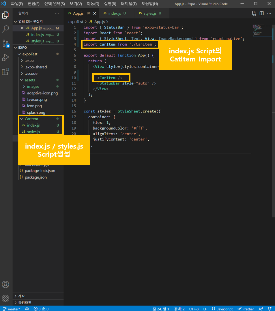
import { StatusBar } from 'expo-status-bar';
import React from 'react';
import { StyleSheet, Text, View, ImageBackground } from 'react-native';
import CarItem from './CarItem'; /*CarItem_index.js import*/

export default function App() {
  return (
    <View style={styles.container}>

      <CarItem /> {/*CarItem_index.js code사용*/}
      <StatusBar style="auto" />
    </View>
  );
}

const styles = StyleSheet.create({
  container: {
    flex: 1,
    backgroundColor: '#fff',
    alignItems: 'center',
    justifyContent: 'center',
  },
});
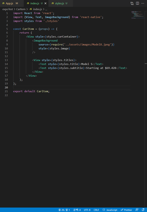
import React from 'react';
import {View, Text, ImageBackground} from 'react-native';
import styles from './styles'

const CarItem = (props) => {
    return (
        <View style={styles.carContainer}>
            <ImageBackground
                source={require('../assets/images/ModelX.jpeg')}
                style={styles.image}
            />

            <View style={styles.titles}>
                <Text style={styles.title}>Model S</Text>
                <Text style={styles.subtitle}>Starting at $69.428</Text>
            </View>
        </View>
    );
};

export default CarItem;
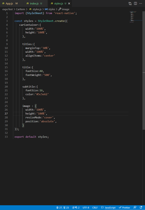
 import {StyleSheet} from 'react-native';

 const styles = StyleSheet.create({
    carContainer:{
        width:'100%',
        height:'100%',
      },

      titles:{
        marginTop:'30%',
        width:'100%',
        alignItems:'center'
      },

      title:{
        fontSize:40,
        fontWeight:'500',
      },

      subtitle:{
        fontSize:16,
        color:'#5c5e62'
      },

      image : {
        width:'100%',
        height:'100%',
        resizeMode:'cover',
        position:'absolute',
      }
 });

 export default styles;

import React from 'react';
import {View, Text, Pressable} from 'react-native';
import styles from './styles';

const StyleButton = (props) => {

    return (
        <View style={styles.container}>
            <Pressable
                style={styles.button}
                onPress={()=> console.warn ('Hey there')}
            >
                <Text style={styles.text}>Custom Order</Text>
            </Pressable>
        </View>
    );
};

export default StyleButton;
import {StyleSheet} from 'react-native';

const styles = StyleSheet.create({
    container: {
        width:'100%',
        padding:10,
    },

    button: {
        height:40,
        borderRadius:20, /*Button radius설정*/
        justifyContent : 'center', /*vertical기준 : Text Center*/
        alignItems :'center', /*Horizontal기준 : Text Center*/
    },

    text: {
        fontSize:12,
        fontWeight:'500',
        textTransform:'uppercase', /*대문자 세팅*/
    }
});

export default styles;
import React from 'react';
import {View, Text, ImageBackground} from 'react-native';
import StyleButton  from '../StyleButton';
import styles from './styles'

const CarItem = (props) => {
    return (
        <View style={styles.carContainer}>
            <ImageBackground
                source={require('../assets/images/ModelX.jpeg')}
                style={styles.image}
            />

            <View style={styles.titles}>
                <Text style={styles.title}>Model S</Text>
                <Text style={styles.subtitle}>Starting at $69.428</Text>
            </View>

            <StyleButton
                type='primary'
                content={"Custom Order"}
                onPress={()=>{
                    console.warn("Custom Order was pressed")
                }}
            />
            {/*Parameter : Type, Content, onPress시 출력 될 텍스트*/}
            <StyleButton
                type='secondary'
                content={"Existing Inventory"}
                onPress={()=>{
                    console.warn("Existing Inventory was pressed")
                }}
            />
        </View>
    );
};

export default CarItem;
import React from 'react';
import {View, Text, Pressable} from 'react-native';
import styles from './styles';

const StyleButton = (props) => {

    const {type, content, onPress} = props;
    {/*type, contet, onPress : CarItem_index.js에서 별도지정될 수 있도록 선언*/}

    const backgroundColor = type === 'primary' ? '#171a20CC' : '#FFFFFFA6';
    const textColor = type === 'primary' ? '#FFFFFFA6' : '#171a20CC';
    /*Background Color, Text Color : CarItem_index.js에서 지정한 type에 따라 색상을 어떻게 설정할지 Setting*/

    return (
        <View style={styles.container}>
            <Pressable
                style={[styles.button, {backgroundColor : backgroundColor}]}
                onPress={()=>onPress()}
            >
                <Text style={[styles.text, {color : textColor}]}>{content}</Text>
            </Pressable>
            {/*Background Color, Text Color, Content: 위에서 Setting한 type별 색상이 적용되도록 설정*/}
        </View>
    );
};

export default StyleButton;
import React from 'react';
import {View, Text, ImageBackground} from 'react-native';
import StyleButton from '../StyleButton';
import styles from './styles'
const CarItem = (props) => {
const {name, tagline, taglineCTA, image} = props;
{/*name, tagline, image : App.js에서 별도 지정할 수 있도록 선언*/}
return (
<View style={styles.carContainer}>
{/*name, tagline, image : App.js에서 별도 지정할 수 있도록 설정*/}
<ImageBackground
source={image}
style={styles.image}
/>
<View style={styles.titles}>
<Text style={styles.title}>{name}</Text>
<Text style={styles.subtitle}>
{tagline}
<Text style={styles.subtitleCTA}>
{/*Tochless Delivery 텍스트의 경우, 클릭 가능하도록 별도 스타일 지정*/}
{taglineCTA}
</Text>
</Text>
</View>
<View style={styles.buttonsContainer}>
{/*Button 위치조정을 위해 하나의 그룹으로 묶어준 뒤 style.js에서 작업*/}
<StyleButton
type='primary'
content={"Custom Order"}
onPress={()=>{
console.warn("Custom Order was pressed")
}}
/>
<StyleButton
type='secondary'
content={"Existing Inventory"}
onPress={()=>{
console.warn("Existing Inventory was pressed")
}}
/>
</View>
</View>
);
};
export default CarItem;
 import {StyleSheet} from 'react-native';

 const styles = StyleSheet.create({
    carContainer:{
        width:'100%',
        height:'100%',
      },

      titles:{
        marginTop:'30%',
        width:'100%',
        alignItems:'center'
      },

      title:{
        fontSize:40,
        fontWeight:'500',
      },

      subtitle:{
        fontSize:16,
        color:'#5c5e62'
      },

      subtitleCTA:{
        /*Tochless Delivery 텍스트의 경우, 클릭 가능하도록 별도 스타일 지정*/
        textDecorationLine:'underline',
      },

      image : {
        width:'100%',
        height:'100%',
        resizeMode:'cover',
        position:'absolute',
      },

      /*Button 위치조정*/
      buttonsContainer: {
        position: 'absolute',
        bottom: 50,
        width: '100%'
      }
 });

 export default styles;
import { StatusBar } from 'expo-status-bar';
import React from 'react';
import { StyleSheet, Text, View, ImageBackground } from 'react-native';
import CarItem from './CarItem';
export default function App() {
return (
<View style={styles.container}>
<CarItem
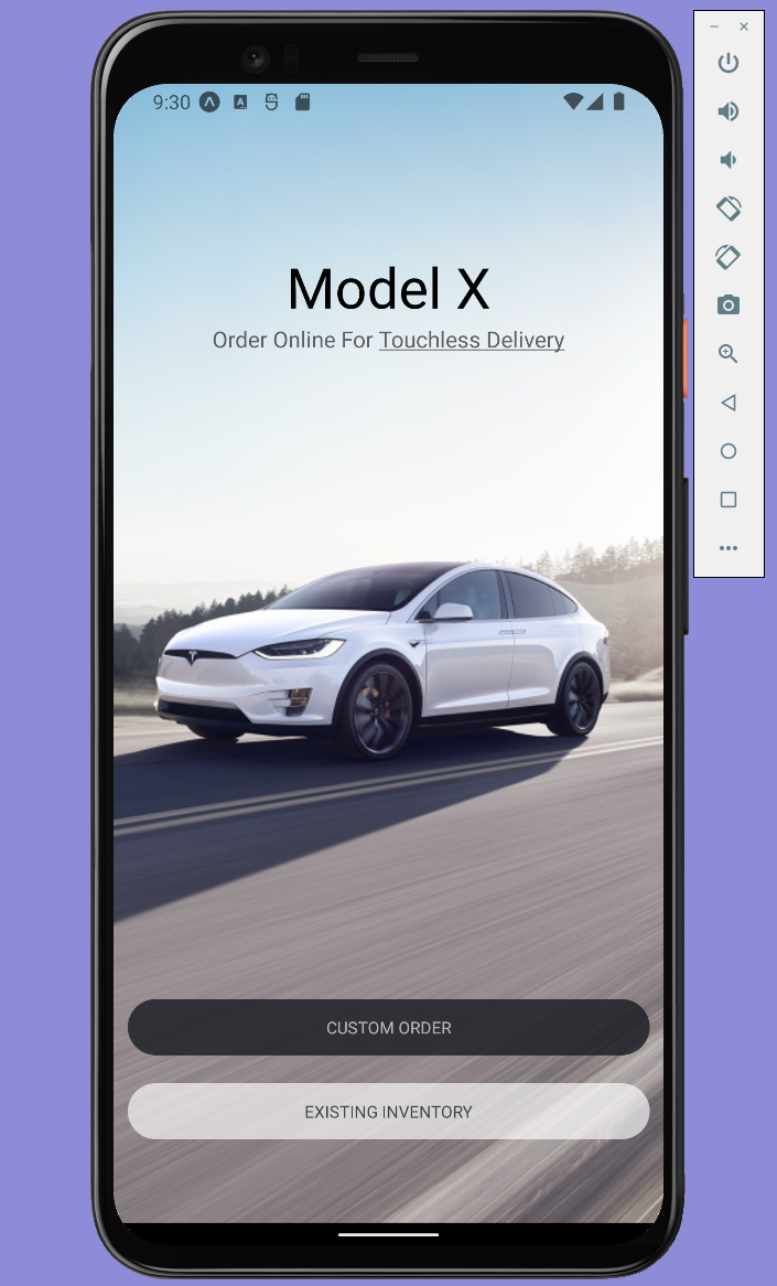
name={"Model X"}
tagline={"Order Online For"}
taglineCTA={"Touchless Delivery"}
image={require('./assets/images/ModelX.jpeg')}
/>
{/*CarItem_index.js에서 name, tagline, image는 별도 지정하는 것으로 수정하였으므로 해당 스크립트에서 별도지정*/}
<StatusBar style="auto" />
</View>
);
}
const styles = StyleSheet.create({
container: {
flex: 1,
backgroundColor: '#fff',
alignItems: 'center',
justifyContent: 'center',
},
});
import React from 'react';
import {View, Text, ImageBackground} from 'react-native';
import StyleButton from '../StyleButton';
import styles from './styles'
const CarItem = (props) => {
const {name, tagline, taglineCTA, image} = props.car;
return (
<View style={styles.carContainer}>
<ImageBackground
source={image}
style={styles.image}
/>
<View style={styles.titles}>
<Text style={styles.title}>{name}</Text>
<Text style={styles.subtitle}>
{tagline}
<Text style={styles.subtitleCTA}>
{taglineCTA}
</Text>
</Text>
</View>
<View style={styles.buttonsContainer}>
<StyleButton
type='primary'
content={"Custom Order"}
onPress={()=>{
console.warn("Custom Order was pressed")
}}
/>
<StyleButton
type='secondary'
content={"Existing Inventory"}
onPress={()=>{
console.warn("Existing Inventory was pressed")
}}
/>
</View>
</View>
);
};
export default CarItem;
 import {StyleSheet, Dimensions} from 'react-native';

 const styles = StyleSheet.create({
    carContainer:{
        width:'100%',
        height: Dimensions.get('window').height,
        /**/
      },

      titles:{
        marginTop:'30%',
        width:'100%',
        alignItems:'center'
      },

      title:{
        fontSize:40,
        fontWeight:'500',
      },

      subtitle:{
        fontSize:16,
        color:'#5c5e62'
      },

      subtitleCTA:{
        textDecorationLine:'underline',
      },

      image : {
        width:'100%',
        height:'100%',
        resizeMode:'cover',
        position:'absolute',
      },

      buttonsContainer: {
        position: 'absolute',
        bottom: 50,
        width: '100%'
      }
 });

 export default styles;
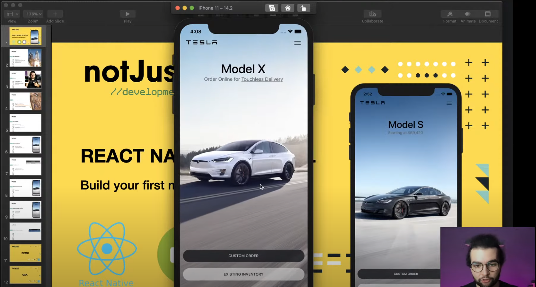
export default [{
  name: 'Model S',
  tagline: 'Starting at $69,420',
  image: require('../assets/images/ModelS.jpeg'),
}, {
  name: 'Model 3',
  tagline: 'Order Online for',
  taglineCTA: 'Touchless Delivery',
  image: require('../assets/images/Model3.jpeg'),
}, {
  name: 'Model X',
  tagline: 'Order Online for',
  taglineCTA: 'Touchless Delivery',
  image: require('../assets/images/ModelX.jpeg'),
}, {
  name: 'Model Y',
  tagline: 'Order Online for',
  taglineCTA: 'Touchless Delivery',
  image: require('../assets/images/ModelY.jpeg'),
}];
import React from 'react';
import {View, FlatList} from 'react-native';

import CarItem from '../CarItem';
import styles from './styles';
import cars from './cars';

const CarsList = (props) => {
    return (
        <View style={styles.container}>
            <FlatList
            /*FlatList : 출력해야 하는 데이터 양이 많은 경우, 모든 데이터를 한 번에 렌더링 하지 않고 보여지는 부분 혹은 수동으로 설정한 양 만큼의 데이터만 렌더링 되도록 하는 Comonent*/
                data={cars}
                renderItem={({item}) => <CarItem car={item} />}
            />
        </View>
    );
};

export default CarsList;
import {StyleSheet} from 'react-native';

const styles = StyleSheet.create({
    container:{
        width:'100%',
    }
});

export default styles;
import { StatusBar } from 'expo-status-bar';
import React from 'react';
import { StyleSheet, View } from 'react-native';
import CarsList from './CarsList';

export default function App() {
  return (
    <View style={styles.container}>
      <CarsList />
      {/*기존 CarItem_index.js에서 가져오던 정보를 CarsList_index/js에서 가져오도록 수정 (다수 페이지 생성을 위함)*/}
      <StatusBar style="auto" />
    </View>
  );
}

const styles = StyleSheet.create({
  container: {
    flex: 1,
    backgroundColor: '#fff',
    alignItems: 'center',
    justifyContent: 'center',
  },
});
# React Native Navigation ### Contents 1. Getting started 2. Hello Reac...
# React Native_Spotify Mobile App Clone ## Contents 1. Initialise the ...
Contents React Native란? React Native환경세팅 React Native란? React ...
Avenco comes with a built-in contact form.
